ABOUT
As a personal project, I wanted to redesign Google Maps to incorporate the features I wanted to see, primarily rooted in my desire to seamlessly integrate both of the Maps and My Maps applications.
ROLE
UX designer
Visual Design
01. Search
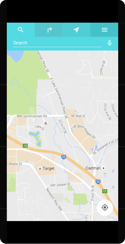
When the user opens up the app, they will see a tab-style navigation bar at the top with the search bar propagated as the default.
Rationale for the navigation bar:
- To visually separate the menu button from the search bar
(Many Google apps attach the menu button to a floating search box, making it difficult to locate and causing confusion over the hierarchy in that it feels like a menu of the search box, not the app itself) - To tidy up the interface by connecting “Search,” “Directions,” and “Explore” in a more intuitive group
I am curious about the placement of the “Directions” button above the GPS in the current app. It seems to be in a more ergonomic region of the screen, but I would love to know the research of its usage compared to users going to the “Search” box to lead to directions.
02. Directions
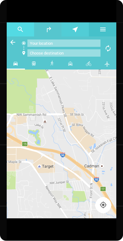
Tapping the “Directions” icon to the right of the “Search” icon will bring up the directions panel, where users can input their starting point and destination.
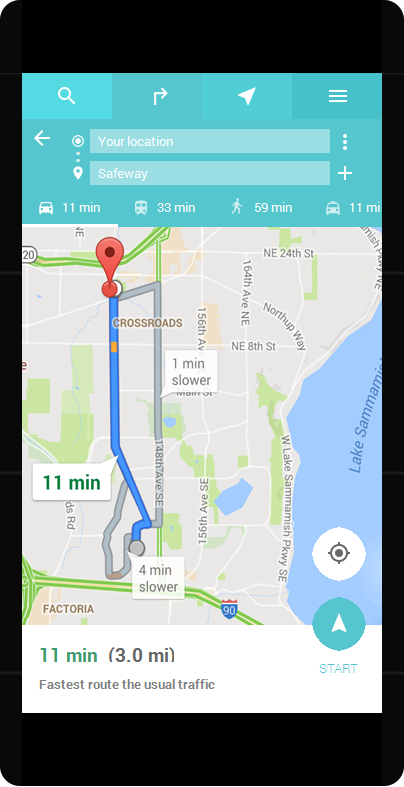
I added the plane as a transit method and the ability to add multiple destinations for a trip, as both features are currently only available on the browser.*
Note: When I began working on this, I integrated the ability to add multiple destinations on mobile, as it was an essential feature that many users and myself wanted to see that didn’t exist in the application at the time. As of mid-2016, the feature has been added (version 9.21). Hooray!
A potential problem with navigating multiple destinations while en route is ensuring that a destination has been reached before deciding when to begin navigating to the next destination. If the navigation immediately jumps into the next route, that could confuse the user if they haven’t actually gotten to their first destination (this is especially the case when navigating hard to find places such as homes or apartment complexes in dense neighborhoods).
My solution for this is to provide a popup for the user on the interface to tap to begin the next navigation sequence.


