ABOUT
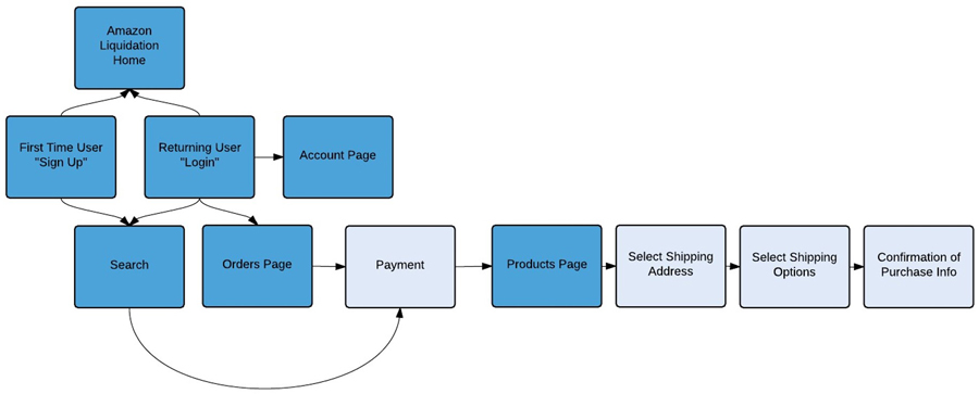
My team and I explored an Amazon B2B concept through research and design. Through our collaboration, we organized a competitive audit, conducted phone interviews, crafted user personas, developed wireframes, and created a sitemap.
ROLE
User researcher, UX designer
Competitive Analysis
We researched four existing competitor liquidator websites, detailing each site’s categories, search functionality, product display, registration requirements, payment handling, and shipping options. We also critiqued each site’s user interface, noting the cleanliness of the layout and the intuitiveness of the experience flow.
We organized our facts and insights along with supporting screenshots in our Competitive Audit, providing a summary of our findings and offering our detailed recommendations based on our research.
User Research
With a list of over 100 business names that expressed interest in an Amazon B2B website, I tracked down and compiled their contact information, location time zone, and a brief summary of their business in a spreadsheet. We divvied the information and coordinated our schedules to reach out to these companies in order to schedule our interviews.
My team and I came up with 36 interview questions which ranged from demographic information to the logistics of their own business. Our questions included asking about the vendors they currently use, the average price per transaction, and who their end customers are. We also asked about any shortcomings they’ve encountered as well as features or improvements they would like to see.
Wireframes
There were many considerations to take into account in designing the site, since liquidation sales have very unique criteria compared to normal retail websites, such as showing the makeup of a product lots as they may contain mixed items that vary in brand and condition. The areas my team and I wireframed are below.
01. Search
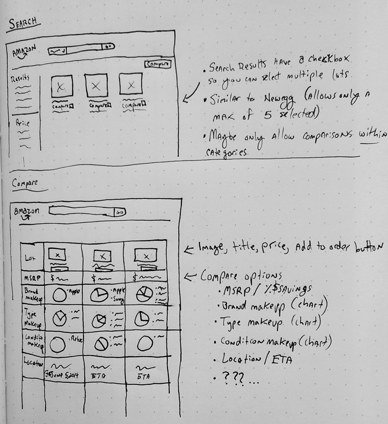
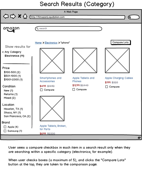
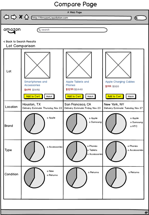
The categories available to filter results include price, condition, location, and brand. We chose to display the retail value of the lot next to the purchase price to emphasize a sense of savings. There is also a small, expandable spark chart in the lower right of the lot image that conveys the brand makeup of the lot. A unique feature that I implemented was a compare checkbox, which lets the user select up to three lots to compare side-by-side.
02. Products
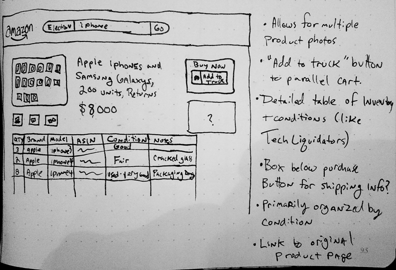
Unique to a regular product webpage, we included a lot-composition chart showing brand, model, quantity, ASIN (Amazon Standard Identification Number), condition, and relevant notes about the condition. As liquidation lots are often large and require freight shipping, I added a friendly, “Add to Truck” button, instead of “Add to Cart,” to indicate an intent to purchase.
03. Purchase
Along with a credit or debit card, a wire transfer is an available method payment, as our comparative analysis revealed that it was often exclusively the only method of payment for other liquidators.
04. Shipping
Users have the option to provide their own shipping, such as having their own truck pick up their purchase at an Amazon warehouse. A concept we suggested was to quantify the volume of lots in order to fill up a truck for cost efficiency, so one truck might hold 21 pallets. This is similar to Amazon Prime Pantry where customers fill up a standard size box with items, showing how much space each item takes up and how much space remains in the box.
05. Account
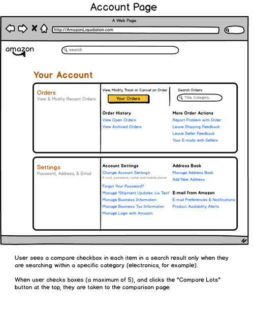
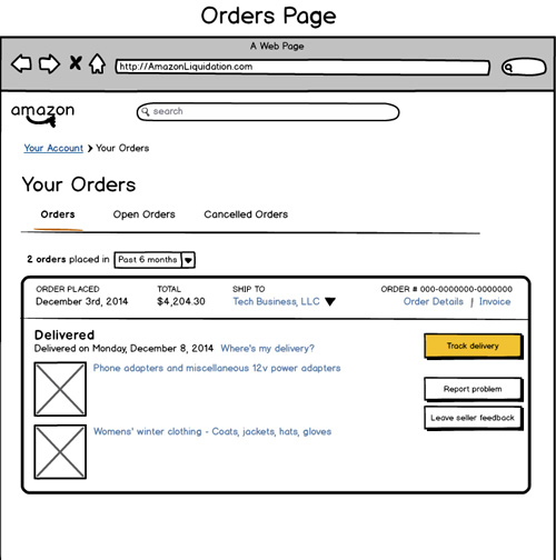
With account registration, users are required to provide their wholesale license ID in order to make purchases. In the account pages, users can view and manage their orders, view shipping and privacy policies, update their payment and business information, and also contact Amazon with questions or problems. We also included a feature to for users to be notified of new lots that meet their criteria.
